> ## Documentation Index
> Fetch the complete documentation index at: https://cometchat-22654f5b-docs-v6-beta2-flutter-uikit.mintlify.site/llms.txt
> Use this file to discover all available pages before exploring further.
# Component Styling
> Style CometChat UI Kit components using XML theme attributes or Compose style data classes.
| Field | Value |
| ----------------- | ----------------------------------------------------------------------------------------------------------------------------------------------------------------------------------------- |
| Kotlin XML Views | Override XML styles in `themes.xml` extending component parent styles (e.g., `CometChatConversationsStyle`), assign via theme attributes |
| Jetpack Compose | Pass style data classes as parameters (e.g., `CometChatConversationsStyle`, `CometChatMessageListStyle`) with `.default()` and `.copy()` |
| Pattern (XML) | Create custom style → extend parent → assign to `AppTheme` via theme attribute |
| Pattern (Compose) | Call `ComponentStyle.default().copy(property = value)` → pass as `style` parameter |
| Related | [Theme Introduction](/ui-kit/android/v6/theme-introduction) · [Color Resources](/ui-kit/android/v6/color-resources) · [Message Bubble Styling](/ui-kit/android/v6/message-bubble-styling) |
This page shows how to style CometChat UI Kit components in Android. It is written for Android developers customizing UI Kit v6.
## When to use this
* You want UI Kit screens (lists, headers, and message UI) to match your brand colors and typography.
* You need to customize calling and AI UI components without rebuilding UI from scratch.
* You prefer centralized styling through `res/values/themes.xml` (XML Views) or style data classes (Compose).
* You want consistent iconography by supplying your own vector drawables.
* You need a repeatable pattern that can be applied across components.
## Prerequisites
* CometChat Android UI Kit v6 installed in your app.
* Your app theme extends `CometChatTheme.DayNight` (for XML Views).
* You can edit `res/values/themes.xml` in your Android module.
* You can add drawable resources to `res/drawable/` when needed.
* You rebuild or sync Gradle after updating styles.
## Styling Pattern
Components read styles from XML theme attributes. The pattern is:
1. Open `res/values/themes.xml`.
2. Create a custom style that extends the component's parent style (for example, `CometChatConversationsStyle`).
3. Assign your custom style to `AppTheme` using the component's theme attribute (for example, `cometchatConversationsStyle`).
4. Sync Gradle and rebuild the app.
5. Navigate to the screen that uses the component and confirm the visual change.
```xml themes.xml lines theme={null}
```
You can also set fonts globally:
```xml themes.xml lines theme={null}
```
Components accept a `style` parameter — a data class with `.default()` factory and `.copy()` for overrides:
```kotlin lines theme={null}
CometChatConversations(
style = CometChatConversationsStyle.default().copy(
backgroundColor = Color(0xFFFFF9F5),
titleTextColor = Color(0xFFF76808)
)
)
```
Nested styles (e.g., avatar inside conversations) are overridden the same way:
```kotlin lines theme={null}
CometChatConversations(
style = CometChatConversationsStyle.default().copy(
avatarStyle = CometChatAvatarStyle.default().copy(
backgroundColor = Color(0xFFFBAA75),
cornerRadius = 8.dp
)
)
)
```
## Core concepts
* `AppTheme` is the single place where UI Kit style hooks are wired (XML Views).
* Each UI Kit component has a parent style (for example, `CometChatMessageListStyle`) and a theme attribute (for example, `cometchatMessageListStyle`).
* Custom styles must extend the correct parent style to inherit default behavior.
* Drawable overrides (for example, custom icons) live in `res/drawable/` and are referenced from styles.
* Fonts can be set once at the theme level and reused across components.
***
## Implementation
Use the following sections to style each component. Each section lists what changes, where to change it, the exact code to paste, and how to verify the result.
### Chat Lists & Messaging
#### Conversations
The `CometChatConversations` component renders the recent chats list.
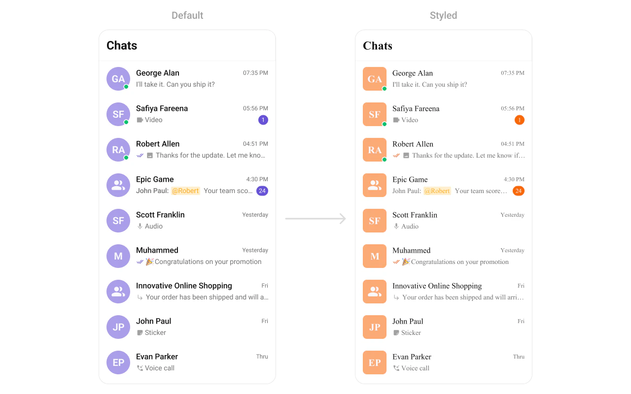 What you're changing: avatar and badge styling in the conversation list.
* **Where to change it**: `res/values/themes.xml` (XML Views) or `style` parameter (Compose)
* **Applies to**: `CometChatConversations`
* **Default behavior**: UI Kit default avatar and badge styles.
* **Override**: set `cometchatConversationsStyle` in `AppTheme` or pass a style object.
```xml themes.xml lines theme={null}
```
```kotlin lines theme={null}
CometChatConversations(
style = CometChatConversationsStyle.default().copy(
avatarStyle = CometChatAvatarStyle.default().copy(
backgroundColor = Color(0xFFFBAA75),
cornerRadius = 8.dp
),
badgeStyle = CometChatBadgeStyle.default().copy(
backgroundColor = Color(0xFFF76808),
textColor = Color.White
)
)
)
```
* **What this does**: applies custom avatar and badge styles to conversation list items.
* **Verify**: the Conversations list shows updated avatar backgrounds and badge colors.
Attribute references:
* [Conversations attributes](https://github.com/cometchat/cometchat-uikit-android/blob/v6/chatuikit-kotlin/src/main/res/values/attr_cometchat_conversations.xml)
* [Avatar attributes](https://github.com/cometchat/cometchat-uikit-android/blob/v6/chatuikit-kotlin/src/main/res/values/attr_cometchat_avatar.xml)
* [Badge attributes](https://github.com/cometchat/cometchat-uikit-android/blob/v6/chatuikit-kotlin/src/main/res/values/attr_cometchat_badge.xml)
#### Users
The `CometChatUsers` component renders a list of users for selection or navigation.
What you're changing: avatar and badge styling in the conversation list.
* **Where to change it**: `res/values/themes.xml` (XML Views) or `style` parameter (Compose)
* **Applies to**: `CometChatConversations`
* **Default behavior**: UI Kit default avatar and badge styles.
* **Override**: set `cometchatConversationsStyle` in `AppTheme` or pass a style object.
```xml themes.xml lines theme={null}
```
```kotlin lines theme={null}
CometChatConversations(
style = CometChatConversationsStyle.default().copy(
avatarStyle = CometChatAvatarStyle.default().copy(
backgroundColor = Color(0xFFFBAA75),
cornerRadius = 8.dp
),
badgeStyle = CometChatBadgeStyle.default().copy(
backgroundColor = Color(0xFFF76808),
textColor = Color.White
)
)
)
```
* **What this does**: applies custom avatar and badge styles to conversation list items.
* **Verify**: the Conversations list shows updated avatar backgrounds and badge colors.
Attribute references:
* [Conversations attributes](https://github.com/cometchat/cometchat-uikit-android/blob/v6/chatuikit-kotlin/src/main/res/values/attr_cometchat_conversations.xml)
* [Avatar attributes](https://github.com/cometchat/cometchat-uikit-android/blob/v6/chatuikit-kotlin/src/main/res/values/attr_cometchat_avatar.xml)
* [Badge attributes](https://github.com/cometchat/cometchat-uikit-android/blob/v6/chatuikit-kotlin/src/main/res/values/attr_cometchat_badge.xml)
#### Users
The `CometChatUsers` component renders a list of users for selection or navigation.
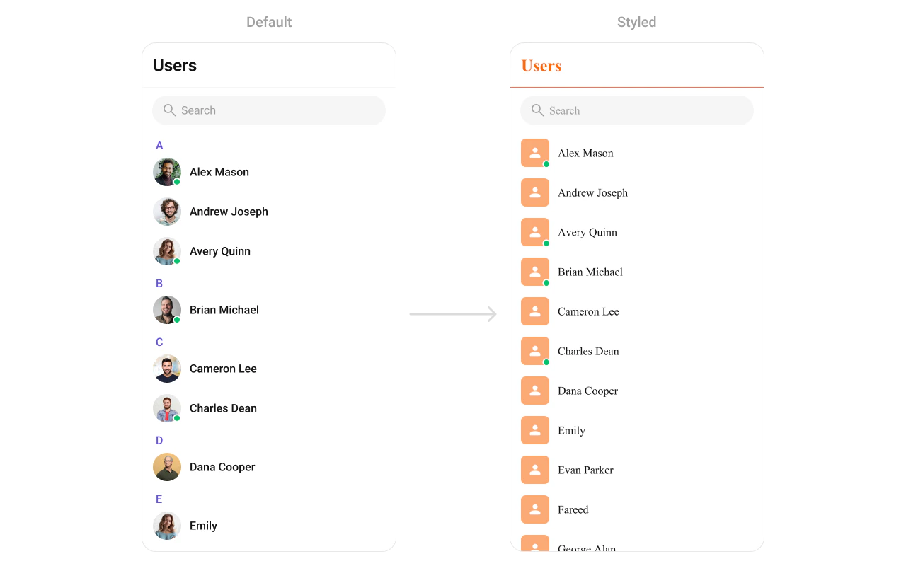 What you're changing: user list avatar and separator styling.
* **Where to change it**: `res/values/themes.xml` (XML Views) or `style` parameter (Compose)
* **Applies to**: `CometChatUsers`
* **Default behavior**: UI Kit default avatar and list styling.
* **Override**: set `cometchatUsersStyle` in `AppTheme` or pass a style object.
```xml themes.xml lines theme={null}
```
```kotlin lines theme={null}
CometChatUsers(
style = CometChatUsersStyle.default().copy(
separatorColor = Color(0xFFF76808),
titleTextColor = Color(0xFFF76808)
)
)
```
* **What this does**: applies avatar and separator color overrides to the user list.
* **Verify**: the Users list shows updated avatar backgrounds and separator color.
Attribute references:
* [Users attributes](https://github.com/cometchat/cometchat-uikit-android/blob/v6/chatuikit-kotlin/src/main/res/values/attr_cometchat_users.xml)
* [Avatar attributes](https://github.com/cometchat/cometchat-uikit-android/blob/v6/chatuikit-kotlin/src/main/res/values/attr_cometchat_avatar.xml)
#### Groups
The `CometChatGroups` component renders group items and their summary data.
What you're changing: user list avatar and separator styling.
* **Where to change it**: `res/values/themes.xml` (XML Views) or `style` parameter (Compose)
* **Applies to**: `CometChatUsers`
* **Default behavior**: UI Kit default avatar and list styling.
* **Override**: set `cometchatUsersStyle` in `AppTheme` or pass a style object.
```xml themes.xml lines theme={null}
```
```kotlin lines theme={null}
CometChatUsers(
style = CometChatUsersStyle.default().copy(
separatorColor = Color(0xFFF76808),
titleTextColor = Color(0xFFF76808)
)
)
```
* **What this does**: applies avatar and separator color overrides to the user list.
* **Verify**: the Users list shows updated avatar backgrounds and separator color.
Attribute references:
* [Users attributes](https://github.com/cometchat/cometchat-uikit-android/blob/v6/chatuikit-kotlin/src/main/res/values/attr_cometchat_users.xml)
* [Avatar attributes](https://github.com/cometchat/cometchat-uikit-android/blob/v6/chatuikit-kotlin/src/main/res/values/attr_cometchat_avatar.xml)
#### Groups
The `CometChatGroups` component renders group items and their summary data.
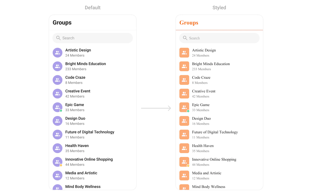 What you're changing: group list avatar and typography colors.
* **Where to change it**: `res/values/themes.xml` (XML Views) or `style` parameter (Compose)
* **Applies to**: `CometChatGroups`
* **Default behavior**: UI Kit default group item styling.
* **Override**: set `cometchatGroupsStyle` in `AppTheme` or pass a style object.
```xml themes.xml lines theme={null}
```
```kotlin lines theme={null}
CometChatGroups(
style = CometChatGroupsStyle.default().copy(
separatorColor = Color(0xFFF76808),
titleTextColor = Color(0xFFF76808)
)
)
```
* **What this does**: styles group avatars and separators in the Groups list.
* **Verify**: the Groups list shows the updated avatar background and title color.
Attribute references:
* [Groups attributes](https://github.com/cometchat/cometchat-uikit-android/blob/v6/chatuikit-kotlin/src/main/res/values/attr_cometchat_groups.xml)
* [Avatar attributes](https://github.com/cometchat/cometchat-uikit-android/blob/v6/chatuikit-kotlin/src/main/res/values/attr_cometchat_avatar.xml)
#### Message Header
The `CometChatMessageHeader` component renders the title, avatar, and action icons for a chat.
What you're changing: group list avatar and typography colors.
* **Where to change it**: `res/values/themes.xml` (XML Views) or `style` parameter (Compose)
* **Applies to**: `CometChatGroups`
* **Default behavior**: UI Kit default group item styling.
* **Override**: set `cometchatGroupsStyle` in `AppTheme` or pass a style object.
```xml themes.xml lines theme={null}
```
```kotlin lines theme={null}
CometChatGroups(
style = CometChatGroupsStyle.default().copy(
separatorColor = Color(0xFFF76808),
titleTextColor = Color(0xFFF76808)
)
)
```
* **What this does**: styles group avatars and separators in the Groups list.
* **Verify**: the Groups list shows the updated avatar background and title color.
Attribute references:
* [Groups attributes](https://github.com/cometchat/cometchat-uikit-android/blob/v6/chatuikit-kotlin/src/main/res/values/attr_cometchat_groups.xml)
* [Avatar attributes](https://github.com/cometchat/cometchat-uikit-android/blob/v6/chatuikit-kotlin/src/main/res/values/attr_cometchat_avatar.xml)
#### Message Header
The `CometChatMessageHeader` component renders the title, avatar, and action icons for a chat.
 What you're changing: title text color, avatar styling, and call button icons.
* **Where to change it**: `res/values/themes.xml` (XML Views) or `style` parameter (Compose)
* **Applies to**: `CometChatMessageHeader`
* **Default behavior**: UI Kit default header typography and icons.
* **Override**: set `cometchatMessageHeaderStyle` in `AppTheme` or pass a style object.
```xml themes.xml lines theme={null}
```
```kotlin lines theme={null}
CometChatMessageHeader(
style = CometChatMessageHeaderStyle.default().copy(
titleTextColor = Color(0xFFF76808)
)
)
```
* **What this does**: applies custom title color, avatar styling, and call button tints in the message header.
* **Verify**: open a conversation and check the header text and call button icons.
Attribute references:
* [Message Header attributes](https://github.com/cometchat/cometchat-uikit-android/blob/v6/chatuikit-kotlin/src/main/res/values/attr_cometchat_message_header.xml)
* [Call Buttons attributes](https://github.com/cometchat/cometchat-uikit-android/blob/v6/chatuikit-kotlin/src/main/res/values/attr_cometchat_call_buttons.xml)
#### Message List
The `CometChatMessageList` component renders conversation messages and their bubble styles.
What you're changing: title text color, avatar styling, and call button icons.
* **Where to change it**: `res/values/themes.xml` (XML Views) or `style` parameter (Compose)
* **Applies to**: `CometChatMessageHeader`
* **Default behavior**: UI Kit default header typography and icons.
* **Override**: set `cometchatMessageHeaderStyle` in `AppTheme` or pass a style object.
```xml themes.xml lines theme={null}
```
```kotlin lines theme={null}
CometChatMessageHeader(
style = CometChatMessageHeaderStyle.default().copy(
titleTextColor = Color(0xFFF76808)
)
)
```
* **What this does**: applies custom title color, avatar styling, and call button tints in the message header.
* **Verify**: open a conversation and check the header text and call button icons.
Attribute references:
* [Message Header attributes](https://github.com/cometchat/cometchat-uikit-android/blob/v6/chatuikit-kotlin/src/main/res/values/attr_cometchat_message_header.xml)
* [Call Buttons attributes](https://github.com/cometchat/cometchat-uikit-android/blob/v6/chatuikit-kotlin/src/main/res/values/attr_cometchat_call_buttons.xml)
#### Message List
The `CometChatMessageList` component renders conversation messages and their bubble styles.
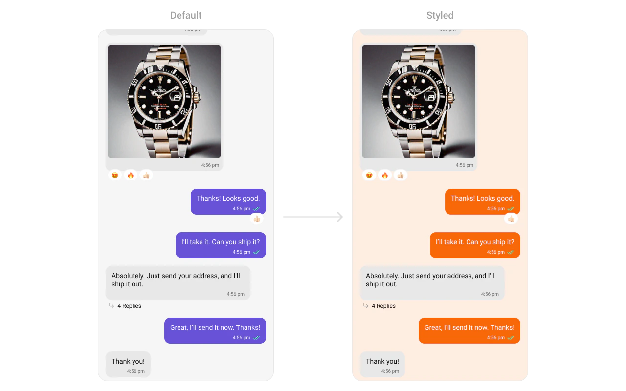 What you're changing: message list background and outgoing bubble styling.
* **Where to change it**: `res/values/themes.xml` (XML Views) or `style` parameter (Compose)
* **Applies to**: `CometChatMessageList`
* **Default behavior**: UI Kit default message list background and bubble colors.
* **Override**: set `cometchatMessageListStyle` in `AppTheme` or pass a style object.
```xml themes.xml lines theme={null}
```
```kotlin lines theme={null}
CometChatMessageList(
style = CometChatMessageListStyle.default().copy(
backgroundColor = Color(0xFFFEEDE1),
outgoingMessageBubbleStyle = CometChatOutgoingMessageBubbleStyle.default().copy(
backgroundColor = Color(0xFFF76808)
)
)
)
```
* **What this does**: changes the message list background and outgoing bubble color.
* **Verify**: open a conversation and check outgoing message bubble colors.
Attribute references:
* [Message List attributes](https://github.com/cometchat/cometchat-uikit-android/blob/v6/chatuikit-kotlin/src/main/res/values/attr_cometchat_message_list.xml)
* [Message Bubble attributes](https://github.com/cometchat/cometchat-uikit-android/blob/v6/chatuikit-kotlin/src/main/res/values/attr_cometchat_message_bubble.xml)
#### Message Composer
The `CometChatMessageComposer` component renders the input box and action buttons.
What you're changing: message list background and outgoing bubble styling.
* **Where to change it**: `res/values/themes.xml` (XML Views) or `style` parameter (Compose)
* **Applies to**: `CometChatMessageList`
* **Default behavior**: UI Kit default message list background and bubble colors.
* **Override**: set `cometchatMessageListStyle` in `AppTheme` or pass a style object.
```xml themes.xml lines theme={null}
```
```kotlin lines theme={null}
CometChatMessageList(
style = CometChatMessageListStyle.default().copy(
backgroundColor = Color(0xFFFEEDE1),
outgoingMessageBubbleStyle = CometChatOutgoingMessageBubbleStyle.default().copy(
backgroundColor = Color(0xFFF76808)
)
)
)
```
* **What this does**: changes the message list background and outgoing bubble color.
* **Verify**: open a conversation and check outgoing message bubble colors.
Attribute references:
* [Message List attributes](https://github.com/cometchat/cometchat-uikit-android/blob/v6/chatuikit-kotlin/src/main/res/values/attr_cometchat_message_list.xml)
* [Message Bubble attributes](https://github.com/cometchat/cometchat-uikit-android/blob/v6/chatuikit-kotlin/src/main/res/values/attr_cometchat_message_bubble.xml)
#### Message Composer
The `CometChatMessageComposer` component renders the input box and action buttons.
 What you're changing: send button icon and composer icon tints.
* **Where to change it**: `res/drawable/active_send_button.xml` and `res/values/themes.xml` (XML Views) or `style` parameter (Compose)
* **Applies to**: `CometChatMessageComposer`
* **Default behavior**: UI Kit default composer icons and send button drawable.
* **Override**: set `cometchatMessageComposerStyle` in `AppTheme` or pass a style object.
```xml res/drawable/active_send_button.xml lines theme={null}
```
```xml res/values/themes.xml lines theme={null}
```
```kotlin lines theme={null}
CometChatMessageComposer(
style = CometChatMessageComposerStyle.default().copy(
attachmentIconTint = Color(0xFFF76808),
voiceRecordingIconTint = Color(0xFFF76808),
aiIconTint = Color(0xFFF76808)
)
)
```
* **What this does**: applies custom icon tints and the active send button drawable to the composer.
* **Verify**: the composer shows the custom send button and tinted icons.
Attribute references:
* [Message Composer attributes](https://github.com/cometchat/cometchat-uikit-android/blob/v6/chatuikit-kotlin/src/main/res/values/attr_cometchat_message_composer.xml)
#### Group Members
The `CometChatGroupMembers` component lists users inside a group.
What you're changing: send button icon and composer icon tints.
* **Where to change it**: `res/drawable/active_send_button.xml` and `res/values/themes.xml` (XML Views) or `style` parameter (Compose)
* **Applies to**: `CometChatMessageComposer`
* **Default behavior**: UI Kit default composer icons and send button drawable.
* **Override**: set `cometchatMessageComposerStyle` in `AppTheme` or pass a style object.
```xml res/drawable/active_send_button.xml lines theme={null}
```
```xml res/values/themes.xml lines theme={null}
```
```kotlin lines theme={null}
CometChatMessageComposer(
style = CometChatMessageComposerStyle.default().copy(
attachmentIconTint = Color(0xFFF76808),
voiceRecordingIconTint = Color(0xFFF76808),
aiIconTint = Color(0xFFF76808)
)
)
```
* **What this does**: applies custom icon tints and the active send button drawable to the composer.
* **Verify**: the composer shows the custom send button and tinted icons.
Attribute references:
* [Message Composer attributes](https://github.com/cometchat/cometchat-uikit-android/blob/v6/chatuikit-kotlin/src/main/res/values/attr_cometchat_message_composer.xml)
#### Group Members
The `CometChatGroupMembers` component lists users inside a group.
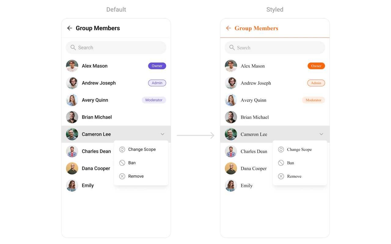 What you're changing: group member list avatars, separators, and back icon tint.
* **Where to change it**: `res/values/themes.xml` (XML Views) or `style` parameter (Compose)
* **Applies to**: `CometChatGroupMembers`
* **Default behavior**: UI Kit default list styling.
* **Override**: set `cometchatGroupMembersStyle` in `AppTheme` or pass a style object.
```xml themes.xml lines theme={null}
```
```kotlin lines theme={null}
CometChatGroupMembers(
style = CometChatGroupMembersStyle.default().copy(
separatorColor = Color(0xFFF76808),
titleTextColor = Color(0xFFF76808)
)
)
```
* **What this does**: applies custom avatar and separator styling to the group members list.
* **Verify**: the group members screen shows updated avatar and separator colors.
Attribute references:
* [Group Members attributes](https://github.com/cometchat/cometchat-uikit-android/blob/v6/chatuikit-kotlin/src/main/res/values/attr_cometchat_group_members.xml)
* [Avatar attributes](https://github.com/cometchat/cometchat-uikit-android/blob/v6/chatuikit-kotlin/src/main/res/values/attr_cometchat_avatar.xml)
#### Thread Header
The `CometChatThreadHeader` component renders the parent message preview in threaded views.
What you're changing: group member list avatars, separators, and back icon tint.
* **Where to change it**: `res/values/themes.xml` (XML Views) or `style` parameter (Compose)
* **Applies to**: `CometChatGroupMembers`
* **Default behavior**: UI Kit default list styling.
* **Override**: set `cometchatGroupMembersStyle` in `AppTheme` or pass a style object.
```xml themes.xml lines theme={null}
```
```kotlin lines theme={null}
CometChatGroupMembers(
style = CometChatGroupMembersStyle.default().copy(
separatorColor = Color(0xFFF76808),
titleTextColor = Color(0xFFF76808)
)
)
```
* **What this does**: applies custom avatar and separator styling to the group members list.
* **Verify**: the group members screen shows updated avatar and separator colors.
Attribute references:
* [Group Members attributes](https://github.com/cometchat/cometchat-uikit-android/blob/v6/chatuikit-kotlin/src/main/res/values/attr_cometchat_group_members.xml)
* [Avatar attributes](https://github.com/cometchat/cometchat-uikit-android/blob/v6/chatuikit-kotlin/src/main/res/values/attr_cometchat_avatar.xml)
#### Thread Header
The `CometChatThreadHeader` component renders the parent message preview in threaded views.
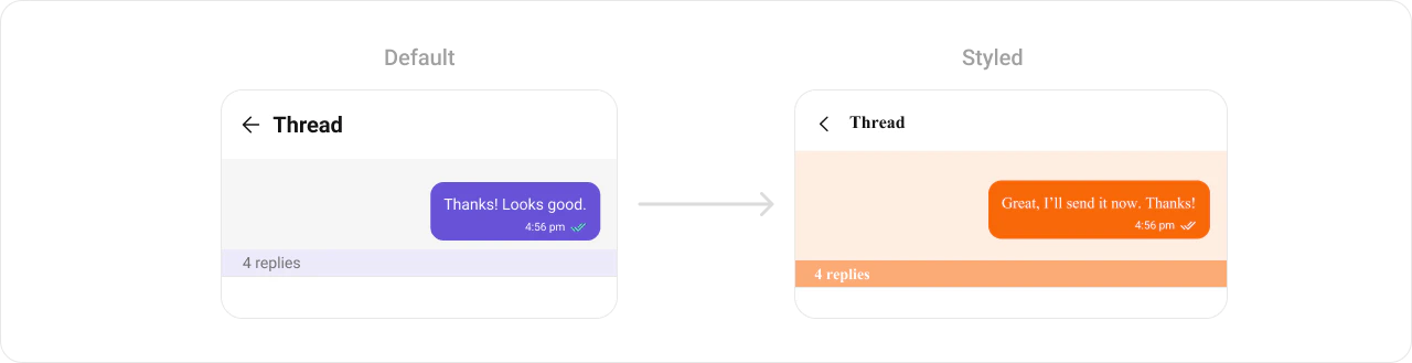 What you're changing: thread header bubble colors and reply count styling.
* **Where to change it**: `res/values/themes.xml` (XML Views) or `style` parameter (Compose)
* **Applies to**: `CometChatThreadHeader`
* **Default behavior**: UI Kit default thread header styling.
* **Override**: set `cometchatThreadHeaderStyle` in `AppTheme` or pass a style object.
```xml themes.xml lines theme={null}
```
```kotlin lines theme={null}
CometChatThreadHeader(
style = CometChatThreadHeaderStyle.default().copy(
backgroundColor = Color(0xFFFEEDE1),
replyCountTextColor = Color(0xFFF76808)
)
)
```
* **What this does**: customizes thread header bubble colors and reply count styling.
* **Verify**: open a thread and confirm the header background and reply count colors.
Attribute references:
* [Thread Header attributes](https://github.com/cometchat/cometchat-uikit-android/blob/v6/chatuikit-kotlin/src/main/res/values/attr_cometchat_thread_header.xml)
* [Message Bubble attributes](https://github.com/cometchat/cometchat-uikit-android/blob/v6/chatuikit-kotlin/src/main/res/values/attr_cometchat_message_bubble.xml)
#### Mentions
The `CometChatMentions` styling controls how user mentions appear inside messages.
What you're changing: thread header bubble colors and reply count styling.
* **Where to change it**: `res/values/themes.xml` (XML Views) or `style` parameter (Compose)
* **Applies to**: `CometChatThreadHeader`
* **Default behavior**: UI Kit default thread header styling.
* **Override**: set `cometchatThreadHeaderStyle` in `AppTheme` or pass a style object.
```xml themes.xml lines theme={null}
```
```kotlin lines theme={null}
CometChatThreadHeader(
style = CometChatThreadHeaderStyle.default().copy(
backgroundColor = Color(0xFFFEEDE1),
replyCountTextColor = Color(0xFFF76808)
)
)
```
* **What this does**: customizes thread header bubble colors and reply count styling.
* **Verify**: open a thread and confirm the header background and reply count colors.
Attribute references:
* [Thread Header attributes](https://github.com/cometchat/cometchat-uikit-android/blob/v6/chatuikit-kotlin/src/main/res/values/attr_cometchat_thread_header.xml)
* [Message Bubble attributes](https://github.com/cometchat/cometchat-uikit-android/blob/v6/chatuikit-kotlin/src/main/res/values/attr_cometchat_message_bubble.xml)
#### Mentions
The `CometChatMentions` styling controls how user mentions appear inside messages.
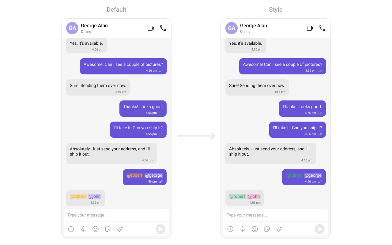 What you're changing: mention text and background styles for incoming and outgoing bubbles.
* **Where to change it**: `res/values/themes.xml` (XML Views) or `style` parameter (Compose)
* **Applies to**: `CometChatMentions`
* **Default behavior**: UI Kit default mention styling.
* **Override**: set `cometchatMessageBubbleMentionsStyle` in both incoming and outgoing bubble styles.
```xml themes.xml lines theme={null}
```
```kotlin lines theme={null}
CometChatMessageList(
style = CometChatMessageListStyle.default().copy(
incomingMessageBubbleStyle = CometChatIncomingMessageBubbleStyle.default().copy(
mentionTextColor = Color(0xFFD6409F)
),
outgoingMessageBubbleStyle = CometChatOutgoingMessageBubbleStyle.default().copy(
mentionTextColor = Color.White
)
)
)
```
* **What this does**: customizes mention colors for incoming and outgoing message bubbles.
* **Verify**: send a mention in a chat and check the mention highlight colors.
Attribute references:
* [Mentions attributes](https://github.com/cometchat/cometchat-uikit-android/blob/v6/chatuikit-kotlin/src/main/res/values/attr_cometchat_mentions.xml)
* [Message Bubble attributes](https://github.com/cometchat/cometchat-uikit-android/blob/v6/chatuikit-kotlin/src/main/res/values/attr_cometchat_message_bubble.xml)
***
### Calling UI
#### Call Logs
The `CometChatCallLogs` component renders recent call history.
What you're changing: mention text and background styles for incoming and outgoing bubbles.
* **Where to change it**: `res/values/themes.xml` (XML Views) or `style` parameter (Compose)
* **Applies to**: `CometChatMentions`
* **Default behavior**: UI Kit default mention styling.
* **Override**: set `cometchatMessageBubbleMentionsStyle` in both incoming and outgoing bubble styles.
```xml themes.xml lines theme={null}
```
```kotlin lines theme={null}
CometChatMessageList(
style = CometChatMessageListStyle.default().copy(
incomingMessageBubbleStyle = CometChatIncomingMessageBubbleStyle.default().copy(
mentionTextColor = Color(0xFFD6409F)
),
outgoingMessageBubbleStyle = CometChatOutgoingMessageBubbleStyle.default().copy(
mentionTextColor = Color.White
)
)
)
```
* **What this does**: customizes mention colors for incoming and outgoing message bubbles.
* **Verify**: send a mention in a chat and check the mention highlight colors.
Attribute references:
* [Mentions attributes](https://github.com/cometchat/cometchat-uikit-android/blob/v6/chatuikit-kotlin/src/main/res/values/attr_cometchat_mentions.xml)
* [Message Bubble attributes](https://github.com/cometchat/cometchat-uikit-android/blob/v6/chatuikit-kotlin/src/main/res/values/attr_cometchat_message_bubble.xml)
***
### Calling UI
#### Call Logs
The `CometChatCallLogs` component renders recent call history.
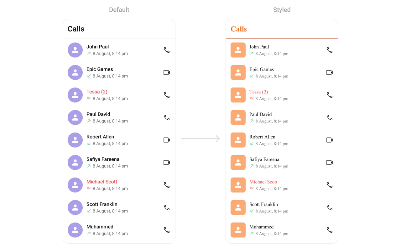 What you're changing: call log list separators and title colors.
* **Where to change it**: `res/values/themes.xml` (XML Views) or `style` parameter (Compose)
* **Applies to**: `CometChatCallLogs`
* **Default behavior**: UI Kit default call log styling.
* **Override**: set `cometchatCallLogsStyle` in `AppTheme` or pass a style object.
```xml themes.xml lines theme={null}
```
```kotlin lines theme={null}
CometChatCallLogs(
style = CometChatCallLogsStyle.default().copy(
separatorColor = Color(0xFFF76808),
titleTextColor = Color(0xFFF76808)
)
)
```
* **What this does**: applies custom avatar and text colors to the call logs list.
* **Verify**: open Call Logs and confirm the separator and title colors.
Attribute references:
* [Call Logs attributes](https://github.com/cometchat/cometchat-uikit-android/blob/v6/chatuikit-kotlin/src/main/res/values/attr_cometchat_call_logs.xml)
#### Incoming Call
The `CometChatIncomingCall` component renders the incoming call UI.
What you're changing: call log list separators and title colors.
* **Where to change it**: `res/values/themes.xml` (XML Views) or `style` parameter (Compose)
* **Applies to**: `CometChatCallLogs`
* **Default behavior**: UI Kit default call log styling.
* **Override**: set `cometchatCallLogsStyle` in `AppTheme` or pass a style object.
```xml themes.xml lines theme={null}
```
```kotlin lines theme={null}
CometChatCallLogs(
style = CometChatCallLogsStyle.default().copy(
separatorColor = Color(0xFFF76808),
titleTextColor = Color(0xFFF76808)
)
)
```
* **What this does**: applies custom avatar and text colors to the call logs list.
* **Verify**: open Call Logs and confirm the separator and title colors.
Attribute references:
* [Call Logs attributes](https://github.com/cometchat/cometchat-uikit-android/blob/v6/chatuikit-kotlin/src/main/res/values/attr_cometchat_call_logs.xml)
#### Incoming Call
The `CometChatIncomingCall` component renders the incoming call UI.
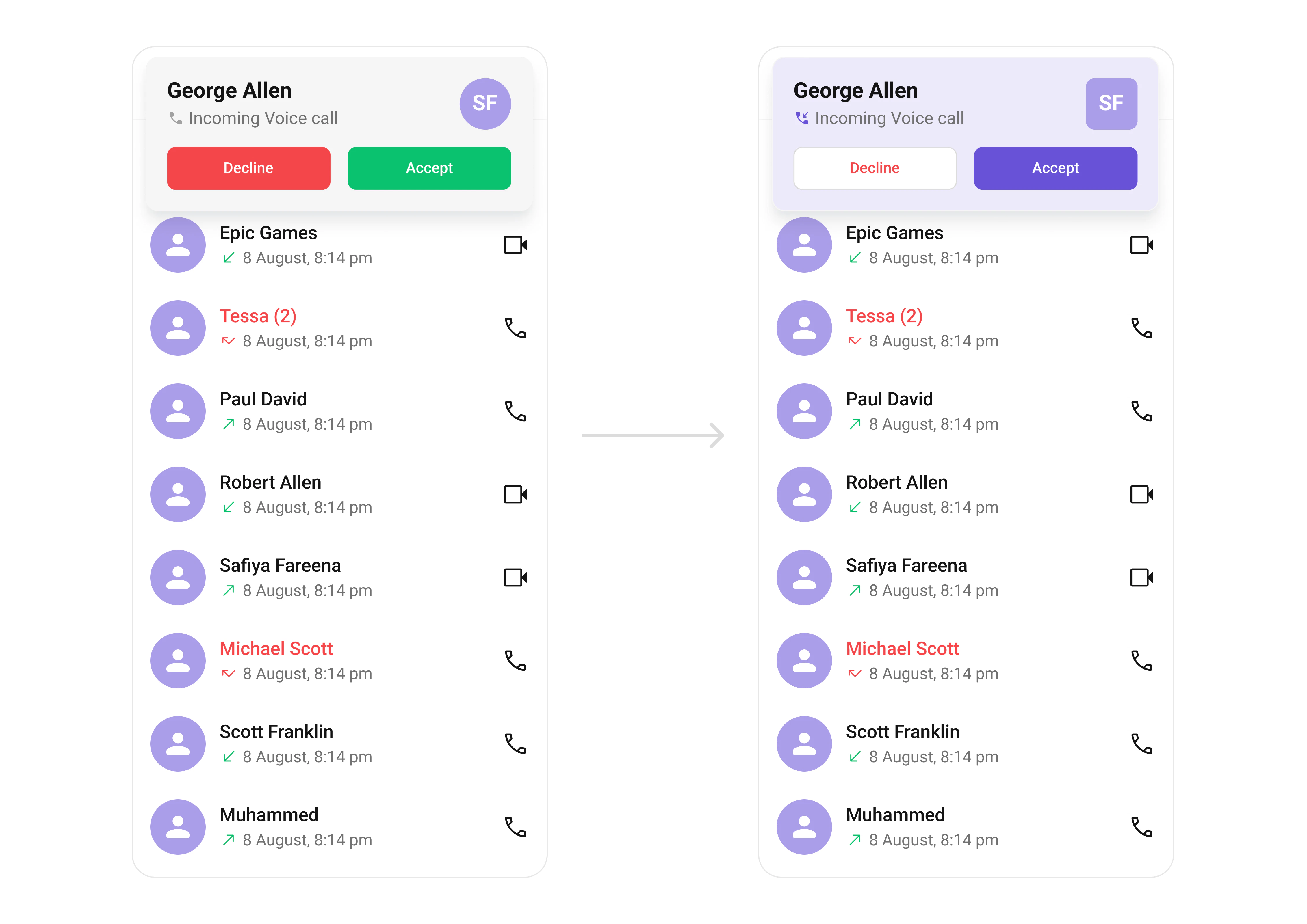 What you're changing: incoming call background, buttons, and avatar styling.
* **Where to change it**: `res/values/themes.xml` (XML Views) or `style` parameter (Compose)
* **Applies to**: `CometChatIncomingCall`
* **Default behavior**: UI Kit default incoming call layout and colors.
* **Override**: set `cometchatIncomingCallStyle` in `AppTheme` or pass a style object.
```xml themes.xml lines theme={null}
```
```kotlin lines theme={null}
CometChatIncomingCall(
call = call,
style = CometChatIncomingCallStyle.default().copy(
backgroundColor = Color(0xFFAA9EE8)
)
)
```
* **What this does**: customizes the incoming call screen background and action buttons.
* **Verify**: trigger an incoming call and confirm the background and button colors.
Attribute references:
* [Incoming Call attributes](https://github.com/cometchat/cometchat-uikit-android/blob/v6/chatuikit-kotlin/src/main/res/values/attr_cometchat_incoming_call.xml)
* [Avatar attributes](https://github.com/cometchat/cometchat-uikit-android/blob/v6/chatuikit-kotlin/src/main/res/values/attr_cometchat_avatar.xml)
#### Outgoing Call
The `CometChatOutgoingCall` component renders the outgoing call UI.
What you're changing: incoming call background, buttons, and avatar styling.
* **Where to change it**: `res/values/themes.xml` (XML Views) or `style` parameter (Compose)
* **Applies to**: `CometChatIncomingCall`
* **Default behavior**: UI Kit default incoming call layout and colors.
* **Override**: set `cometchatIncomingCallStyle` in `AppTheme` or pass a style object.
```xml themes.xml lines theme={null}
```
```kotlin lines theme={null}
CometChatIncomingCall(
call = call,
style = CometChatIncomingCallStyle.default().copy(
backgroundColor = Color(0xFFAA9EE8)
)
)
```
* **What this does**: customizes the incoming call screen background and action buttons.
* **Verify**: trigger an incoming call and confirm the background and button colors.
Attribute references:
* [Incoming Call attributes](https://github.com/cometchat/cometchat-uikit-android/blob/v6/chatuikit-kotlin/src/main/res/values/attr_cometchat_incoming_call.xml)
* [Avatar attributes](https://github.com/cometchat/cometchat-uikit-android/blob/v6/chatuikit-kotlin/src/main/res/values/attr_cometchat_avatar.xml)
#### Outgoing Call
The `CometChatOutgoingCall` component renders the outgoing call UI.
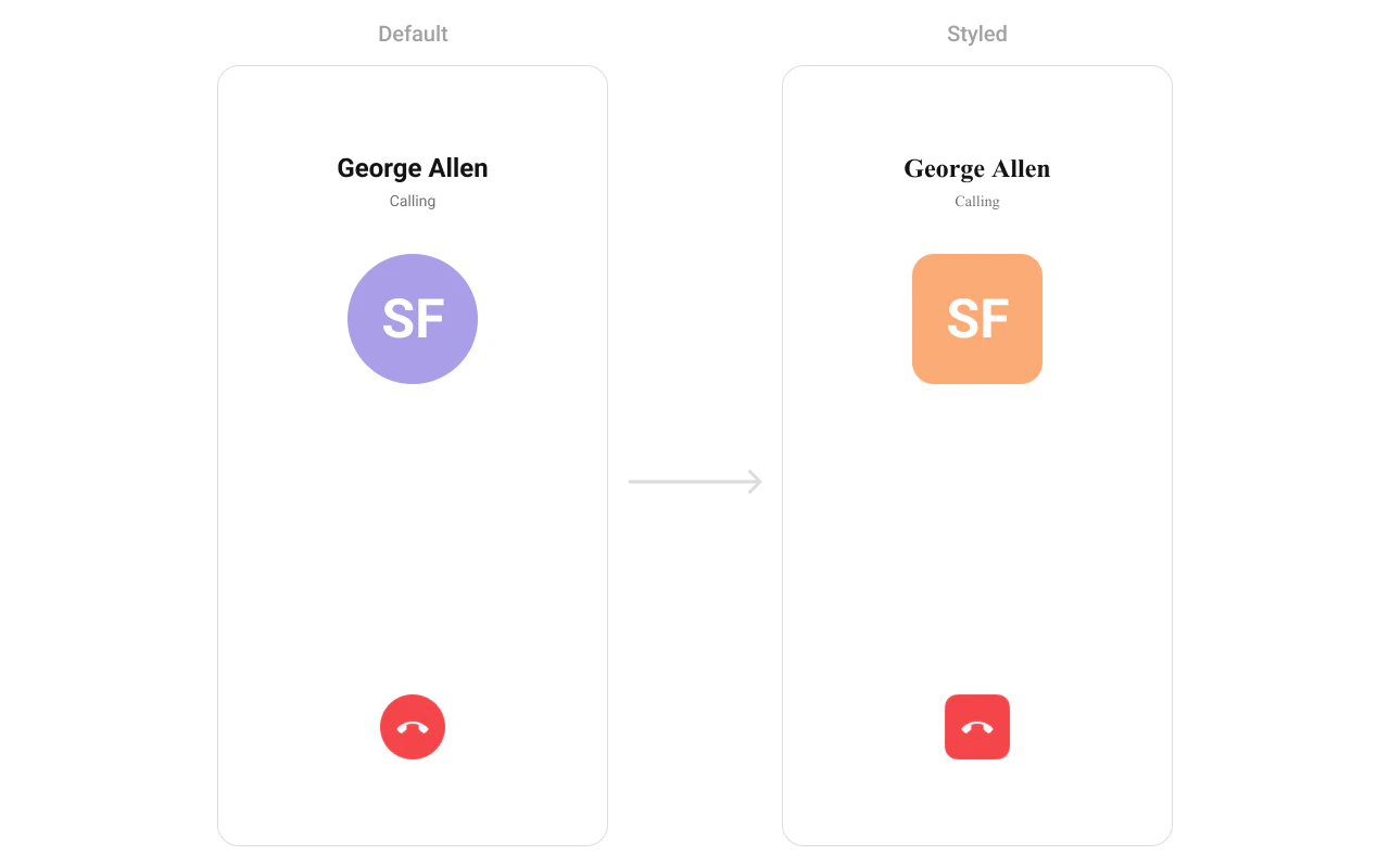 What you're changing: outgoing call avatar styling.
* **Where to change it**: `res/values/themes.xml` (XML Views) or `style` parameter (Compose)
* **Applies to**: `CometChatOutgoingCall`
* **Default behavior**: UI Kit default outgoing call styling.
* **Override**: set `cometchatOutgoingCallStyle` in `AppTheme` or pass a style object.
```xml themes.xml lines theme={null}
```
```kotlin lines theme={null}
CometChatOutgoingCall(
call = call,
style = CometChatOutgoingCallStyle.default().copy(
avatarStyle = CometChatAvatarStyle.default().copy(
backgroundColor = Color(0xFFFBAA75)
)
)
)
```
* **What this does**: applies a custom avatar style to the outgoing call screen.
* **Verify**: place a call and confirm the avatar styling.
Attribute references:
* [Outgoing Call attributes](https://github.com/cometchat/cometchat-uikit-android/blob/v6/chatuikit-kotlin/src/main/res/values/attr_cometchat_outgoing_call.xml)
* [Avatar attributes](https://github.com/cometchat/cometchat-uikit-android/blob/v6/chatuikit-kotlin/src/main/res/values/attr_cometchat_avatar.xml)
***
### Base Components
#### Avatar
The `CometChatAvatar` component is used across lists and headers.
What you're changing: outgoing call avatar styling.
* **Where to change it**: `res/values/themes.xml` (XML Views) or `style` parameter (Compose)
* **Applies to**: `CometChatOutgoingCall`
* **Default behavior**: UI Kit default outgoing call styling.
* **Override**: set `cometchatOutgoingCallStyle` in `AppTheme` or pass a style object.
```xml themes.xml lines theme={null}
```
```kotlin lines theme={null}
CometChatOutgoingCall(
call = call,
style = CometChatOutgoingCallStyle.default().copy(
avatarStyle = CometChatAvatarStyle.default().copy(
backgroundColor = Color(0xFFFBAA75)
)
)
)
```
* **What this does**: applies a custom avatar style to the outgoing call screen.
* **Verify**: place a call and confirm the avatar styling.
Attribute references:
* [Outgoing Call attributes](https://github.com/cometchat/cometchat-uikit-android/blob/v6/chatuikit-kotlin/src/main/res/values/attr_cometchat_outgoing_call.xml)
* [Avatar attributes](https://github.com/cometchat/cometchat-uikit-android/blob/v6/chatuikit-kotlin/src/main/res/values/attr_cometchat_avatar.xml)
***
### Base Components
#### Avatar
The `CometChatAvatar` component is used across lists and headers.
 What you're changing: avatar shape and background color.
* **Where to change it**: `res/values/themes.xml` (XML Views) or `style` parameter (Compose)
* **Applies to**: `CometChatAvatar`
* **Default behavior**: UI Kit default avatar styling.
* **Override**: set `cometchatAvatarStyle` in `AppTheme` or pass a style object.
```xml themes.xml lines theme={null}
```
```kotlin lines theme={null}
// Globally via CometChatConversations, CometChatUsers, etc.
style = ComponentStyle.default().copy(
avatarStyle = CometChatAvatarStyle.default().copy(
backgroundColor = Color(0xFFFBAA75),
cornerRadius = 8.dp
)
)
```
* **What this does**: applies a consistent avatar style across UI Kit components.
* **Verify**: open any list with avatars and confirm the style.
Attribute references:
* [Avatar attributes](https://github.com/cometchat/cometchat-uikit-android/blob/v6/chatuikit-kotlin/src/main/res/values/attr_cometchat_avatar.xml)
#### Badge
The `CometChatBadge` component shows unread or notification counts.
What you're changing: avatar shape and background color.
* **Where to change it**: `res/values/themes.xml` (XML Views) or `style` parameter (Compose)
* **Applies to**: `CometChatAvatar`
* **Default behavior**: UI Kit default avatar styling.
* **Override**: set `cometchatAvatarStyle` in `AppTheme` or pass a style object.
```xml themes.xml lines theme={null}
```
```kotlin lines theme={null}
// Globally via CometChatConversations, CometChatUsers, etc.
style = ComponentStyle.default().copy(
avatarStyle = CometChatAvatarStyle.default().copy(
backgroundColor = Color(0xFFFBAA75),
cornerRadius = 8.dp
)
)
```
* **What this does**: applies a consistent avatar style across UI Kit components.
* **Verify**: open any list with avatars and confirm the style.
Attribute references:
* [Avatar attributes](https://github.com/cometchat/cometchat-uikit-android/blob/v6/chatuikit-kotlin/src/main/res/values/attr_cometchat_avatar.xml)
#### Badge
The `CometChatBadge` component shows unread or notification counts.
 What you're changing: badge background, text color, and corner radius.
* **Where to change it**: `res/values/themes.xml` (XML Views) or `style` parameter (Compose)
* **Applies to**: `CometChatBadge`
* **Default behavior**: UI Kit default badge styling.
* **Override**: set `cometchatBadgeStyle` in `AppTheme` or pass a style object.
```xml themes.xml lines theme={null}
```
```kotlin lines theme={null}
// Via parent component style
style = CometChatConversationsStyle.default().copy(
badgeStyle = CometChatBadgeStyle.default().copy(
backgroundColor = Color(0xFFF44649),
textColor = Color.White,
cornerRadius = 4.dp
)
)
```
* **What this does**: applies a custom badge appearance across UI Kit lists.
* **Verify**: check any unread badge to confirm colors and radius.
Attribute references:
* [Badge attributes](https://github.com/cometchat/cometchat-uikit-android/blob/v6/chatuikit-kotlin/src/main/res/values/attr_cometchat_badge.xml)
#### Status Indicator
The `CometChatStatusIndicator` component shows user presence status.
What you're changing: badge background, text color, and corner radius.
* **Where to change it**: `res/values/themes.xml` (XML Views) or `style` parameter (Compose)
* **Applies to**: `CometChatBadge`
* **Default behavior**: UI Kit default badge styling.
* **Override**: set `cometchatBadgeStyle` in `AppTheme` or pass a style object.
```xml themes.xml lines theme={null}
```
```kotlin lines theme={null}
// Via parent component style
style = CometChatConversationsStyle.default().copy(
badgeStyle = CometChatBadgeStyle.default().copy(
backgroundColor = Color(0xFFF44649),
textColor = Color.White,
cornerRadius = 4.dp
)
)
```
* **What this does**: applies a custom badge appearance across UI Kit lists.
* **Verify**: check any unread badge to confirm colors and radius.
Attribute references:
* [Badge attributes](https://github.com/cometchat/cometchat-uikit-android/blob/v6/chatuikit-kotlin/src/main/res/values/attr_cometchat_badge.xml)
#### Status Indicator
The `CometChatStatusIndicator` component shows user presence status.
 What you're changing: status indicator icon shape and drawable.
* **Where to change it**: `res/values/themes.xml` (XML Views) or `style` parameter (Compose)
* **Applies to**: `CometChatStatusIndicator`
* **Default behavior**: UI Kit default presence icon.
* **Override**: set `cometchatStatusIndicatorStyle` in `AppTheme` or pass a style object.
```xml themes.xml lines theme={null}
```
```kotlin lines theme={null}
// Via parent component style
style = ComponentStyle.default().copy(
statusIndicatorStyle = CometChatStatusIndicatorStyle.default().copy(
cornerRadius = 8.dp
)
)
```
* **What this does**: applies the custom status indicator in UI Kit components.
* **Verify**: check any user list to confirm the presence icon.
Attribute references:
* [Status Indicator attributes](https://github.com/cometchat/cometchat-uikit-android/blob/v6/chatuikit-kotlin/src/main/res/values/attr_cometchat_status_indicator.xml)
#### Reaction List
The `CometChatReactionList` component renders reactions on messages.
What you're changing: status indicator icon shape and drawable.
* **Where to change it**: `res/values/themes.xml` (XML Views) or `style` parameter (Compose)
* **Applies to**: `CometChatStatusIndicator`
* **Default behavior**: UI Kit default presence icon.
* **Override**: set `cometchatStatusIndicatorStyle` in `AppTheme` or pass a style object.
```xml themes.xml lines theme={null}
```
```kotlin lines theme={null}
// Via parent component style
style = ComponentStyle.default().copy(
statusIndicatorStyle = CometChatStatusIndicatorStyle.default().copy(
cornerRadius = 8.dp
)
)
```
* **What this does**: applies the custom status indicator in UI Kit components.
* **Verify**: check any user list to confirm the presence icon.
Attribute references:
* [Status Indicator attributes](https://github.com/cometchat/cometchat-uikit-android/blob/v6/chatuikit-kotlin/src/main/res/values/attr_cometchat_status_indicator.xml)
#### Reaction List
The `CometChatReactionList` component renders reactions on messages.
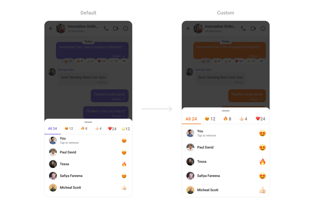 What you're changing: active tab color in the reaction list.
* **Where to change it**: `res/values/themes.xml` (XML Views) or `style` parameter (Compose)
* **Applies to**: `CometChatReactionList`
* **Default behavior**: UI Kit default reaction list styling.
* **Override**: set `cometchatReactionListStyle` in `AppTheme` or pass a style object.
```xml themes.xml lines theme={null}
```
```kotlin lines theme={null}
CometChatReactionList(
style = CometChatReactionListStyle.default().copy(
tabTextActiveColor = Color(0xFFF76808)
)
)
```
* **What this does**: applies a custom active tab color in the reaction list.
* **Verify**: open reactions and confirm the active tab color.
Attribute references:
* [Reaction List attributes](https://github.com/cometchat/cometchat-uikit-android/blob/v6/chatuikit-kotlin/src/main/res/values/attr_cometchat_reaction_list.xml)
***
## Customization matrix
| What you want to change | Where | Property or API | Example |
| ------------------------------ | ------------------------------ | -------------------------------------------------- | ---------------------------------------------- |
| Conversations avatar and badge | `themes.xml` / style param | `cometchatConversationsStyle` | `cometchatConversationsBadgeStyle` |
| Users list separators | `themes.xml` / style param | `cometchatUsersStyle` | `cometchatUsersSeparatorColor` |
| Group list titles | `themes.xml` / style param | `cometchatGroupsStyle` | `cometchatGroupsTitleTextColor` |
| Header call icons | `themes.xml` / style param | `cometchatMessageHeaderStyle` | `cometchatMessageHeaderCallButtonsStyle` |
| Message list background | `themes.xml` / style param | `cometchatMessageListStyle` | `cometchatMessageListBackgroundColor` |
| Composer send button | `res/drawable/` + `themes.xml` | `cometchatMessageComposerActiveSendButtonDrawable` | `@drawable/active_send_button` |
| Call buttons styling | `themes.xml` / style param | `cometchatCallButtonsStyle` | `cometchatCallButtonsVideoCallBackgroundColor` |
What you're changing: active tab color in the reaction list.
* **Where to change it**: `res/values/themes.xml` (XML Views) or `style` parameter (Compose)
* **Applies to**: `CometChatReactionList`
* **Default behavior**: UI Kit default reaction list styling.
* **Override**: set `cometchatReactionListStyle` in `AppTheme` or pass a style object.
```xml themes.xml lines theme={null}
```
```kotlin lines theme={null}
CometChatReactionList(
style = CometChatReactionListStyle.default().copy(
tabTextActiveColor = Color(0xFFF76808)
)
)
```
* **What this does**: applies a custom active tab color in the reaction list.
* **Verify**: open reactions and confirm the active tab color.
Attribute references:
* [Reaction List attributes](https://github.com/cometchat/cometchat-uikit-android/blob/v6/chatuikit-kotlin/src/main/res/values/attr_cometchat_reaction_list.xml)
***
## Customization matrix
| What you want to change | Where | Property or API | Example |
| ------------------------------ | ------------------------------ | -------------------------------------------------- | ---------------------------------------------- |
| Conversations avatar and badge | `themes.xml` / style param | `cometchatConversationsStyle` | `cometchatConversationsBadgeStyle` |
| Users list separators | `themes.xml` / style param | `cometchatUsersStyle` | `cometchatUsersSeparatorColor` |
| Group list titles | `themes.xml` / style param | `cometchatGroupsStyle` | `cometchatGroupsTitleTextColor` |
| Header call icons | `themes.xml` / style param | `cometchatMessageHeaderStyle` | `cometchatMessageHeaderCallButtonsStyle` |
| Message list background | `themes.xml` / style param | `cometchatMessageListStyle` | `cometchatMessageListBackgroundColor` |
| Composer send button | `res/drawable/` + `themes.xml` | `cometchatMessageComposerActiveSendButtonDrawable` | `@drawable/active_send_button` |
| Call buttons styling | `themes.xml` / style param | `cometchatCallButtonsStyle` | `cometchatCallButtonsVideoCallBackgroundColor` |