> ## Documentation Index
> Fetch the complete documentation index at: https://cometchat-22654f5b-docs-v6-beta2-flutter-uikit.mintlify.site/llms.txt
> Use this file to discover all available pages before exploring further.
# Custom CSS
> Customize the CometChat calling UI with custom CSS classes for buttons, video containers, name labels, and grid layouts.
```css theme={null}
/* Key CSS classes for call UI customization */
.cc-main-container { } /* Outermost call container */
.cc-bottom-buttons-container { } /* Bottom action buttons bar */
.cc-name-label { } /* User name text */
.cc-video-container { } /* Video feed container */
.cc-end-call-icon-container { } /* End call button */
.cc-audio-icon-container { } /* Audio toggle button */
.cc-video-icon-container { } /* Video toggle button */
.cc-screen-share-icon-container { } /* Screen share button */
```
**Modes:** `DEFAULT` | `TILE` | `SPOTLIGHT`
The CometChat calling UI exposes CSS classes you can target to style buttons, video containers, labels, and layouts. Your CSS is applied globally — any styles you write for these classes will affect the call UI across all modes (DEFAULT, TILE, SPOTLIGHT).
Before you begin, make sure you've set up [Ringing](/sdk/javascript/default-call) or [Call Session](/sdk/javascript/direct-call).
Only use CSS classes documented here — targeting undocumented classes may cause UI issues. Avoid resizing the grid container to prevent layout distortions.
## CSS Class Reference
### Layout Containers
| Class | Description |
| -------------------- | --------------------------------------------- |
| `cc-main-container` | Outermost container for the calling component |
| `cc-video-container` | Video feed container |
| `cc-name-label` | User name text container |
### Action Buttons
| Class | Description |
| ---------------------------------- | ----------------------------------------------------------- |
| `cc-bottom-buttons-container` | Bottom bar containing action buttons (mute, end call, etc.) |
| `cc-bottom-buttons-icon-container` | Individual button wrapper |
| `cc-audio-icon-container` | Audio toggle button |
| `cc-audio-icon-container-muted` | Audio button (muted state) |
| `cc-video-icon-container` | Video toggle button |
| `cc-video-icon-container-muted` | Video button (muted state) |
| `cc-screen-share-icon-container` | Screen share button |
| `cc-switch-video-icon-container` | Switch camera button |
| `cc-end-call-icon-container` | End call button |
## Examples
### Basic Styling
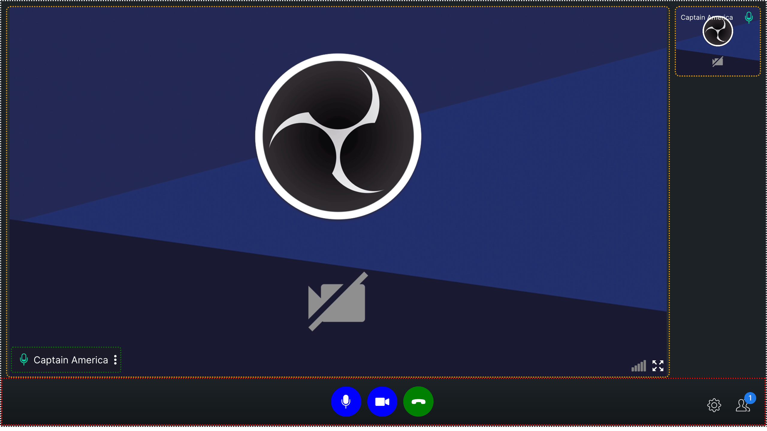
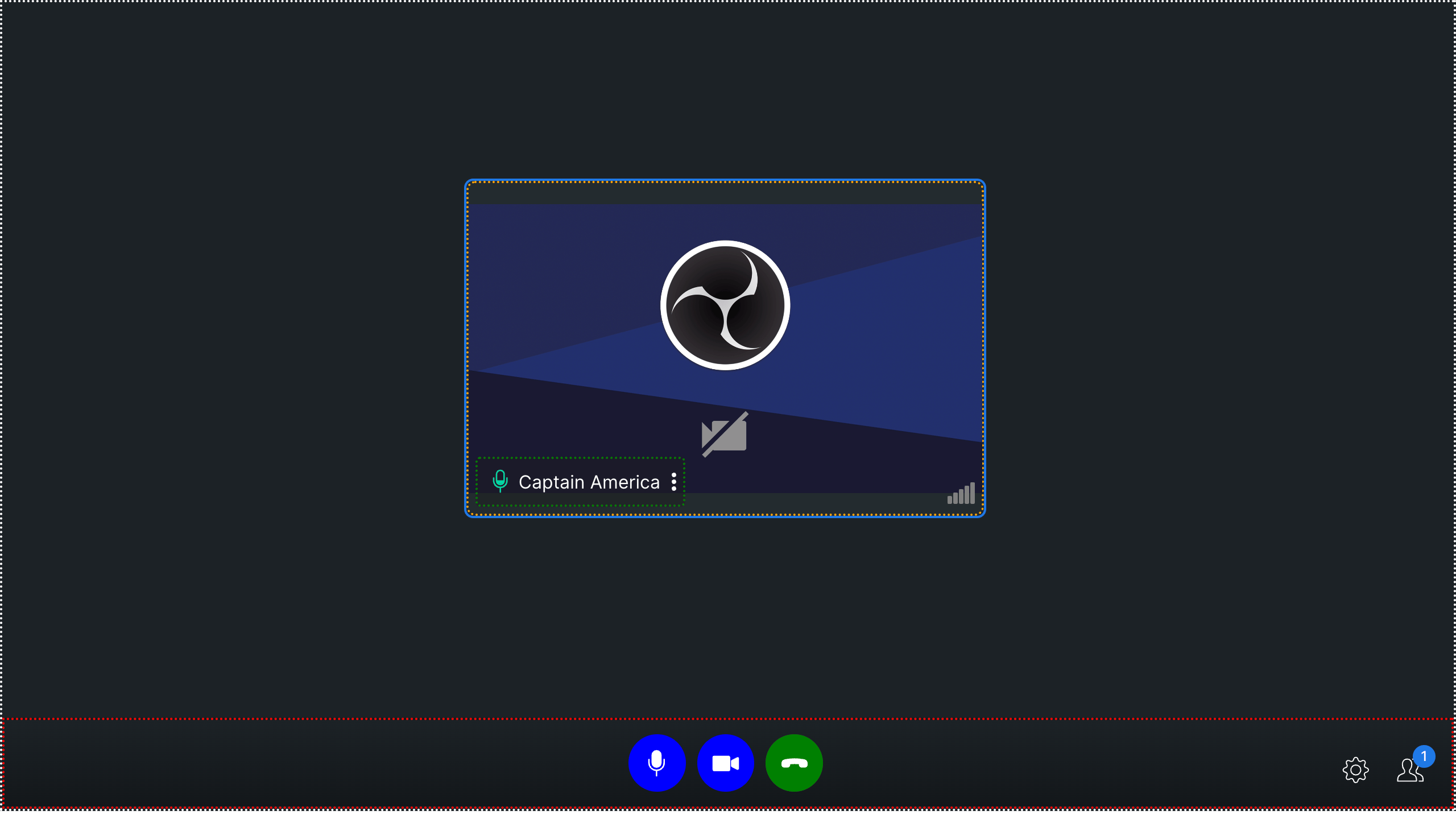
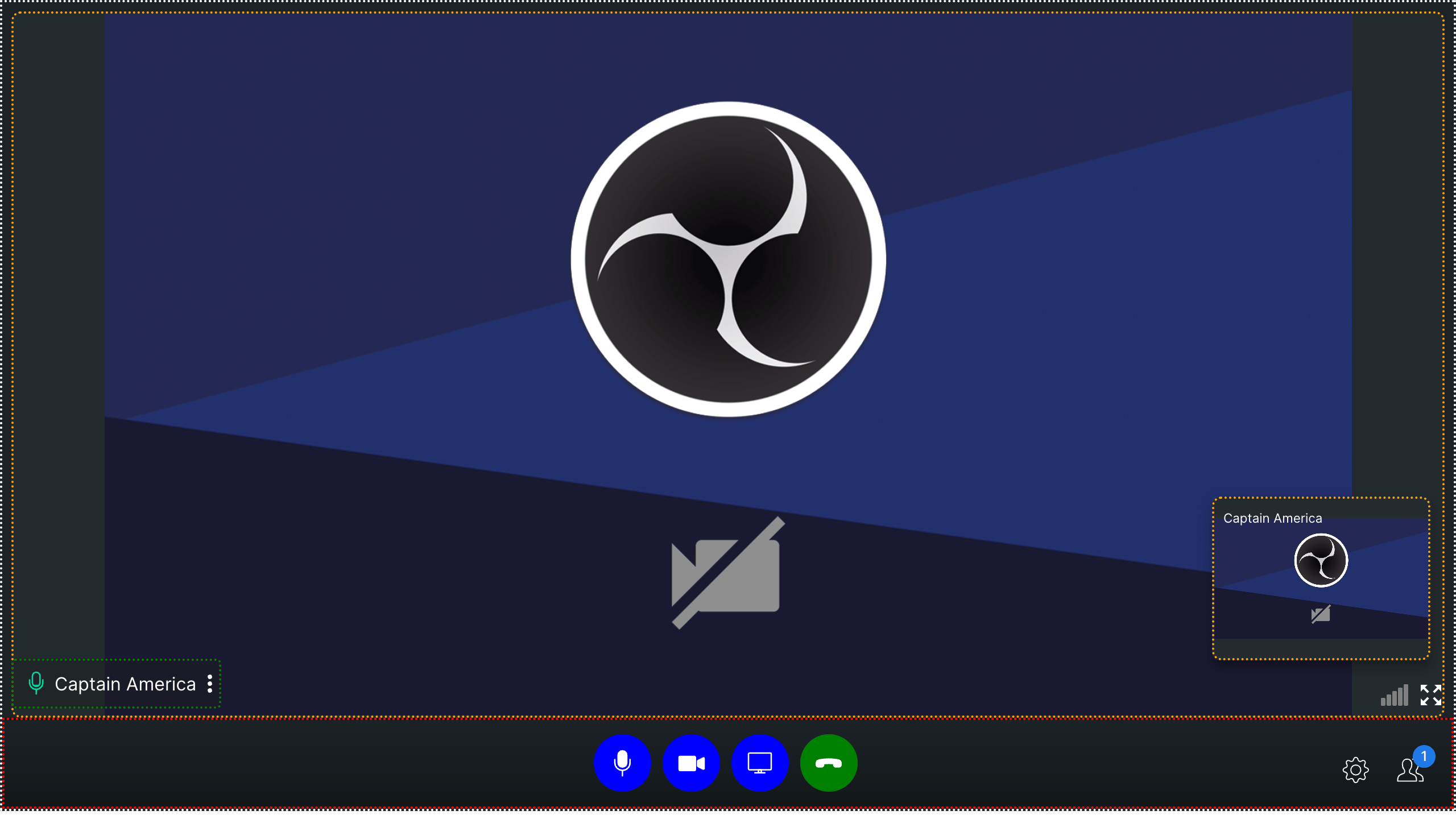
This example applies colored backgrounds to buttons and dotted borders to containers to visualize the layout structure:
```css theme={null}
.cc-end-call-icon-container {
background-color: green;
}
.cc-audio-icon-container {
background-color: blue;
}
.cc-video-icon-container {
background-color: blue;
}
.cc-audio-icon-container-muted {
background-color: orange;
}
.cc-video-icon-container-muted {
background-color: orange;
}
.cc-switch-video-icon-container {
background-color: blue;
}
.cc-screen-share-icon-container {
background-color: blue;
}
.cc-main-container {
border: 2px dotted white;
}
.cc-video-container {
border: 2px dotted orange;
}
.cc-bottom-buttons-container {
border: 2px dotted red;
}
.cc-name-label {
border: 2px dotted green;
}
```
Here's how it looks across the three call modes:
**Mode: `DEFAULT`**
 **Mode: `TILE`**
 **Mode: `SPOTLIGHT`**
 ```css theme={null}
.cc-bottom-buttons-icon-container {
height: 50px !important;
width: 50px !important;
}
.cc-audio-icon-container {
background-color: #0073ff !important;
border-radius: 4px !important;
}
.cc-video-icon-container {
background-color: #0073ff !important;
border-radius: 4px !important;
}
.cc-screen-share-icon-container {
background-color: #0073ff !important;
border-radius: 4px !important;
}
.cc-end-call-icon-container {
background-color: #ab0090 !important;
border-radius: 4px !important;
margin-left: 50px !important;
}
.cc-bottom-buttons.cc-bottom-buttons-container {
gap: 25px !important;
}
.side-bar-main-user-video video {
background-color: black !important;
background-image: repeating-conic-gradient(
#0073ff2a 0% 25%,
#00000031 0% 50%
) !important;
background-position: 0 0, 10px 10px !important;
background-size: 20px 20px !important;
}
.cc-name-label {
background-color: #0073ff !important;
}
.bottom-buttons-other-options {
gap: 20px !important;
}
```
### Polished UI
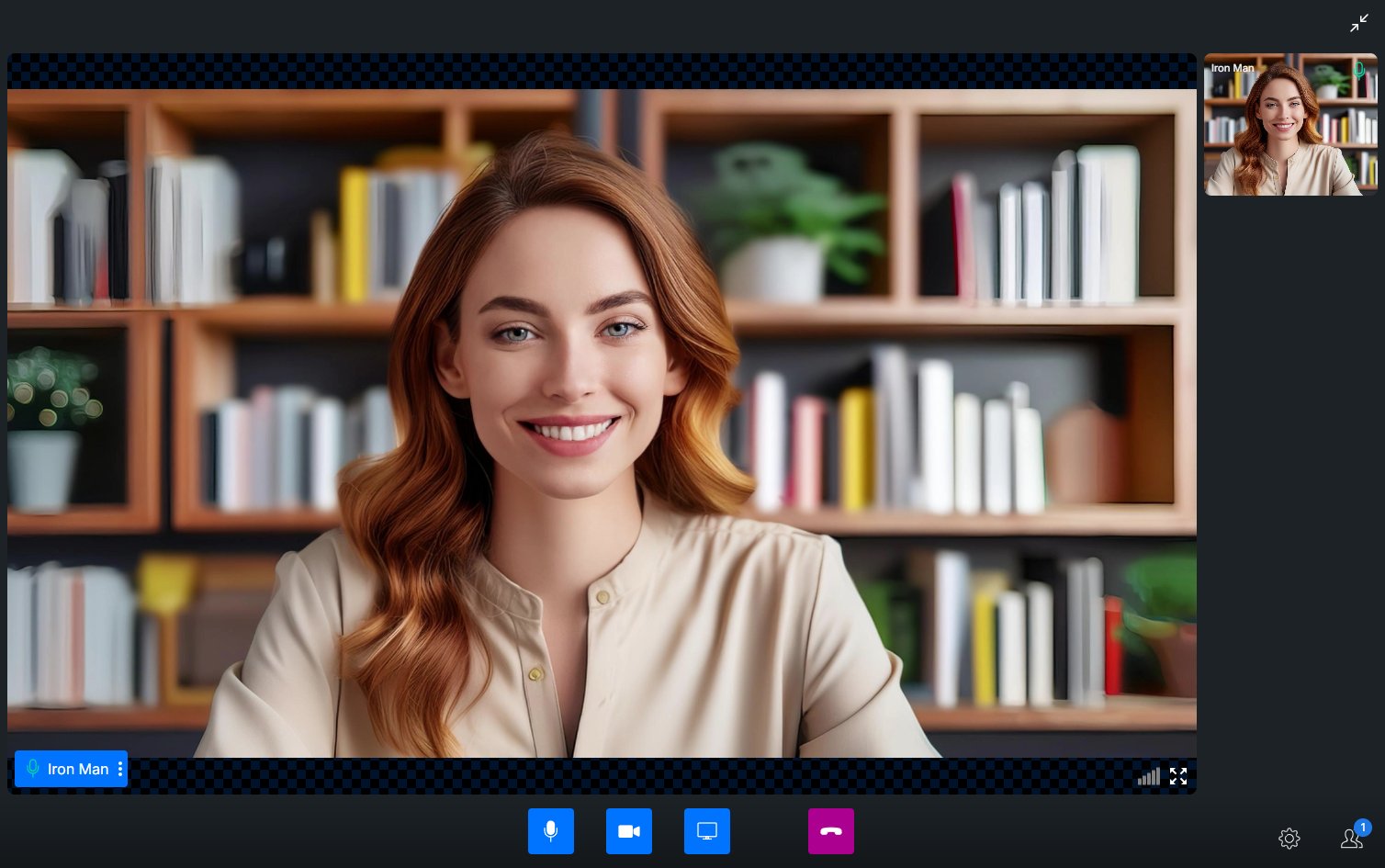
This example shows a more refined customization with rounded buttons, custom spacing, and a patterned video background:
```css theme={null}
.cc-bottom-buttons-icon-container {
height: 50px !important;
width: 50px !important;
}
.cc-audio-icon-container {
background-color: #0073ff !important;
border-radius: 4px !important;
}
.cc-video-icon-container {
background-color: #0073ff !important;
border-radius: 4px !important;
}
.cc-screen-share-icon-container {
background-color: #0073ff !important;
border-radius: 4px !important;
}
.cc-end-call-icon-container {
background-color: #ab0090 !important;
border-radius: 4px !important;
margin-left: 50px !important;
}
.cc-bottom-buttons.cc-bottom-buttons-container {
gap: 25px !important;
}
.side-bar-main-user-video video {
background-color: black !important;
background-image: repeating-conic-gradient(
#0073ff2a 0% 25%,
#00000031 0% 50%
) !important;
background-position: 0 0, 10px 10px !important;
background-size: 20px 20px !important;
}
.cc-name-label {
background-color: #0073ff !important;
}
.bottom-buttons-other-options {
gap: 20px !important;
}
```
### Polished UI
This example shows a more refined customization with rounded buttons, custom spacing, and a patterned video background:
 ***
## Next Steps
Customize video call layout and participant tiles
Apply blur or custom image backgrounds during calls
Overview of all calling features and approaches
***
## Next Steps
Customize video call layout and participant tiles
Apply blur or custom image backgrounds during calls
Overview of all calling features and approaches